In the early days of corporate culture, organisations built empires with a focus on function over form. The office was a utilitarian space—grey cubicles under harsh fluorescent lights. Yet, as our understanding of human psychology has evolved, so too has the approach to commercial office design. Today we have the realm of colour psychology—a field that intertwines the spectrum of hues with the spectrum of human emotions, behaviours, and productivity. This is not just about aesthetics; it’s about leveraging scientific insights to foster an environment where employees can thrive.
The Science Behind Colour Psychology
Colour psychology delves into how different colours affect human emotions and behaviours. This field has garnered substantial interest across various domains, including marketing, healthcare, and notably, office design. Colours can evoke specific emotional responses and even influence physiological reactions. For instance, research indicates that colours can impact mood, mental state, and physical well-being (Frontiers) (Corporate Wellness Magazine).
The dichotomy of warm and cool colours forms the foundation of colour psychology. Warm colours, such as red, orange, and yellow, are associated with energy, excitement, and activity. In contrast, cool colours, such as blue, green, and purple, are linked with calmness, tranquillity, and focus. Understanding these effects allows organisations to use colours strategically to enhance employee wellness and productivity (Corporate Wellness Magazine).
Productivity and Focus
Workplace productivity is paramount, and the choice of colours can significantly influence an employee’s ability to concentrate and perform. Blue emerges as the champion for productivity. Often associated with calmness and focus, blue helps reduce stress levels and enhances concentration. It’s no surprise that blue is a favourite for meeting rooms and individual workstations, where sustained focus is crucial (Corporate Wellness Magazine) (T2B Interiors).
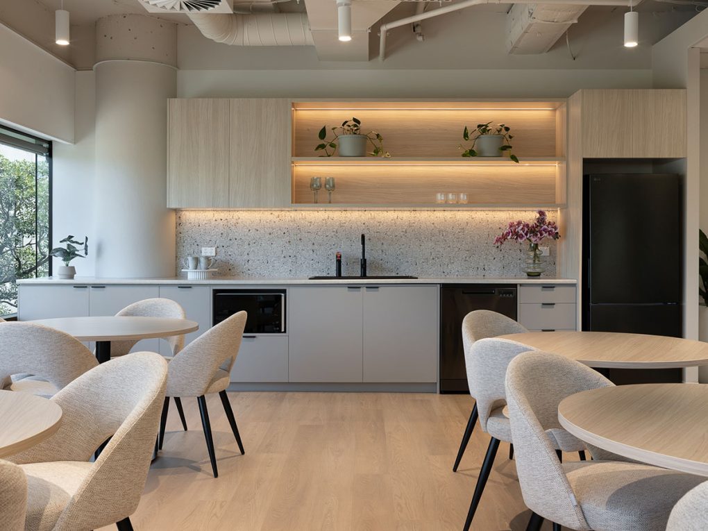
Green, another productivity booster, is reminiscent of nature and has a calming effect. It reduces eye strain and promotes a sense of balance and harmony. This makes it ideal for areas where employees spend long hours, such as open office spaces or computer-heavy environments (Ceebee Design Studio).
Creativity and Energy
If blue and green are the tranquil warriors of productivity, yellow and red are the vibrant champions of creativity and energy. Yellow, bright and cheerful, is known to stimulate creativity and inspire innovation. It’s perfect for brainstorming rooms and collaborative spaces where fresh ideas are born. Yellow mimics natural light, making spaces feel more open and inviting (T2B Interiors).
Red, on the other hand, is a powerful and energising colour. It can increase heart rate and boost energy levels, which can be advantageous in moderation. Used sparingly, such as in accent pieces or high-activity areas, red can invigorate and stimulate conversation (Ceebee Design Studio) (T2B Interiors).
Mood and Well-being
The mood of employees is a critical factor in their overall well-being and productivity. Here, blue and green shine again, known for their calming properties that help reduce stress and promote a tranquil atmosphere. These colours are particularly effective in break rooms and relaxation zones, where employees go to unwind and recharge (Corporate Wellness Magazine) (T2B Interiors).
Warm colours like orange and red can uplift moods and create a welcoming atmosphere. These colours are suitable for common areas and spaces intended for informal interactions. When used thoughtfully, these colours can make the office environment more inviting and comfortable, contributing positively to employee morale (Ceebee Design Studio).
Specific Area Recommendations
Different office areas serve different purposes, and the colour palette should reflect these functional differences:
- Break Areas: Soothing colours like lavender, soft blue, or pale green are perfect for signalling relaxation. These hues help employees detach from work and recharge during their breaks (Corporate Wellness Magazine).
- Collaborative Spaces: Bright colours such as orange and yellow foster an environment conducive to teamwork and creative problem-solving. These vibrant colours can stimulate interaction and the exchange of ideas (Ceebee Design Studio) (T2B Interiors).
- Reception Areas: Using lighter shades of purple in reception areas can convey elegance and ambition, making a strong impression on visitors and creating a sophisticated atmosphere (T2B Interiors).
Practical Tips for Implementation
While understanding the theory behind colour psychology is essential, its practical application can be challenging. Here are some tips for incorporating these insights into your office design:
- Assess Organisational Culture: Choose colours that align with your company’s values and the nature of the work being done. A tech firm focused on innovation might benefit from vibrant, stimulating colours, whereas a healthcare organisation might prefer calming hues to promote tranquillity.
- Match Colours to Functions: Differentiate areas by their function. Use calming colours in rest areas and stimulating colours in collaborative zones to support the specific tasks performed in each space.
- Consider Lighting: Natural and artificial lighting can significantly affect how colours are perceived. Test colours under various lighting conditions to ensure the desired effect is achieved (Corporate Wellness Magazine) (Ceebee Design Studio).
- Seek Professional Guidance: Engaging with a workplace design consultant or colour expert can provide valuable insights and help navigate the complexities of colour psychology. These professionals can ensure that your office design promotes wellness and productivity effectively (Corporate Wellness Magazine).
The Bottom Line
Colour psychology is not just about making an office look good; it’s about creating an environment where employees can perform at their best. By understanding and applying the principles of colour psychology, organisations can transform their offices into spaces that enhance productivity, stimulate creativity, and promote overall well-being. This strategic use of colour can turn a mundane office into a vibrant, efficient, and emotionally supportive workplace.